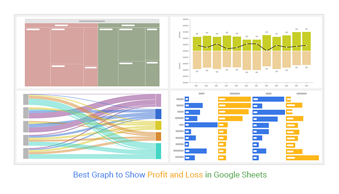
Best Graph to Show Profit and Loss in Google Sheets.
Best Graph to Show Profit and Loss in Google Sheets.
When you have a business, you aim to make a profit. You would also want to avoid losses as much as possible.
As a business person, it is essential to analyze your business profits and losses. Why? Because it helps you know the status of your business and takes note of the areas to improve.
Profits and losses are like the health of your business. If you don’t focus on them, you might risk losing your business.
Therefore, as you conduct your business analysis, it is essential to have the best graph to show profit and loss. To gain critical insights, recording your profits and loss data in tables is insufficient.
In this blog, you will learn more about the best graph to show profit and loss in your business.
Table of Content:
- What is a Profit and Loss (P&L) Statement Analysis?
- What is ChartExpo?
- Best Graphs to Show Profit and Loss Trends
- How to Create Charts to Show Profit and Loss Trends?
- Why Do You Need Visualization To Analyze Your Business’ Profit And Loss Data?
- How are Profit and Loss Charts Beneficial to Your Business?
- Wrap Up
But first, it is essential we take a look at the profit and loss statement.
What is a Profit and Loss (P&L) Statement Analysis?
A profit and loss statement summarizes a company’s profits, losses, expenses, and revenues in a specific timeframe.
For instance, the expenses vs. income graph shows how your business can create profits and manage expenses. This will require you to use accounting principles such as revenue recognition.
Analyzing your business’s profit and loss within a specific timeframe is vital. It can include within a month or fiscal year.
A profit and loss statement includes the following:
- Selling, general and administrative expenses
- Sales revenue
- Technological research and development
- Net income
- Taxes
- Interest expenses
- Cost of sales, and many more.
Focus, and don’t lose sight of this essential information.
Let us learn more about a particular third-party add-on that can help you visualize such data.
What is ChartExpo?
ChartExpo is a tool that we recommend to clients and readers. It is a third-party add-on in your Google Sheets to access the best graph to show profit and loss in your business.
The following reasons why we recommend this tool to our readers:
- It is easy to use on your Excel or Google Sheets
- It is affordable
- Its charts and graphs are of high quality
- It has a significant library size of chart templates
- It is easy to use on your browser
ChartExpo allows anyone who wants to create graphs and charts for various reasons. For example, if you’re going to visualize profit and loss data, ChartExpo has got you covered in profit and loss visualization. You can also make an income vs. expenses graph.
The following section will look at the best graph to show loss and profit trends.
Best Graphs to Show Profit and Loss Trends
Waterfall Chart
A Waterfall Chart depicting profit and loss is a graphical representation that vividly illustrates the financial journey of a business or project over a specified period. It meticulously showcases the cumulative impact of revenue generation and expenditure, with positive segments indicating gains and negative segments denoting losses.
By visually breaking down the components contributing to the overall profit or loss, this chart offers invaluable insights into the financial health and performance of the entity. Stakeholders can make a graph from the table to pinpoint areas of strength, identify potential challenges, and make strategic decisions to optimize profitability.
Sankey Diagram
A Sankey Diagram visualizes data with the flow of information from one set of values to another. The value set that is connected is nodes. The connections between the nodes are called links.
Each flow in a Sankey Diagram has a different height depending on the quantity. As a financial analyst, you can determine the financial contributions to your business. To visualize your data, you can use a Sankey Diagram as a revenue and profit graph.
With a Sankey Diagram, you can draw financial conclusions for your organization. You can easily detect profits and losses a business is making.
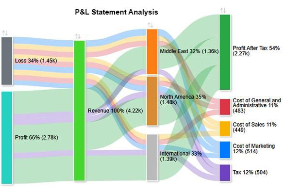
This is the best graph to show profit and loss trends in your data analysis. The screenshot below is an example of a Sankey Diagram.
Treemap
A Treemap is a chart that displays hierarchical data in close rectangles. A Treemap is one of the best charts for profit and loss. Each branch of the Treemap has a rectangle that can have smaller rectangles that act as sub-branches.
Each rectangle has a different color. This shows the viewer that each rectangle has an extra data dimension. Colors are also essential in showing areas in your business that are underperforming or overperforming.
A rectangle’s area is directly proportional to the corresponding data value. While Treemaps and Mekko charts can appear complex, making them challenging for the audience to comprehend easily, they are often used to visualize sales data effectively.
You can also use a Treemap to visualize profit and loss insights in your business. Below is an example of a Treemap.
Matrix Chart
A Matrix Chart is a diagram of individuals analyzing relationships between data sets. A business analyst can use this chart as a planning tool in business management.
There are forms of information you can use in a Matrix Chart. Such include
- Financial information
- Equipment information
- Functions
- profit and loss visualization
Your Matrix Chart will appear depending on the number of functions you wish to compare. With a Matrix Chart, you can identify problems in your business and know where to improve.
A Matrix Chart is one of the best graphs to show profit and loss in your business. It is an advanced revenue and profit graph you cannot find in your Excel or Google Sheets.
Below is an example of a Matrix Chart.
Sentiment Trend Chart
A Sentiment Trend Chart displays variable trends over time. It has positive and negative responses as well.
Forex brokers use this chart to forecast the future of share prices. Even in business, you can use this chart to study your business performance based on past results. For instance, you can use it in your p&l visualization.
A Sentiment Trend Chart has a clear title, a time frame, and a trend line. All these elements help you avoid confusion during interpretation. You can analyze the profits and losses of your business using this chart.
The chart can appear complex in its structure. But it offers the benefit of easy clarity and interpretation. It is one of the best charts for profit and loss.
Below is an example of a Sentiment Trend Chart.
How to Create Charts to Show Profit and Loss Trends?
In this example, we will use a Sankey Diagram to visualize data with profit and loss analysis.
Let’s use the example of the table below.
| Locations | Revenue | Expenses | P&L Analysis | Amount |
| North America | Revenue | Loss | Cost of Sales | 132 |
| North America | Revenue | Loss | Cost of General and Administrative | 159 |
| North America | Revenue | Loss | Cost of Marketing | 170 |
| North America | Revenue | Profit | Tax | 182 |
| North America | Revenue | Profit | Profit After Tax | 834 |
| International | Revenue | Loss | Cost of Sales | 162 |
| International | Revenue | Loss | Cost of General and Administrative | 158 |
| International | Revenue | Loss | Cost of Marketing | 145 |
| International | Revenue | Profit | Tax | 171 |
| International | Revenue | Profit | Profit After Tax | 753 |
| Middle East | Revenue | Loss | Cost of Sales | 155 |
| Middle East | Revenue | Loss | Cost of General and Administrative | 166 |
| Middle East | Revenue | Loss | Cost of Marketing | 199 |
| Middle East | Revenue | Profit | Tax | 151 |
| Middle East | Revenue | Profit | Profit After Tax | 685 |
To start with the best graph to show profit and loss, follow the simple steps:
- Click to open your Google Sheets workbook.
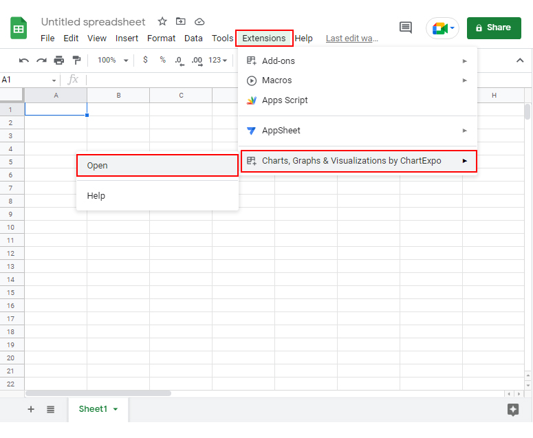
- In your worksheet, click on the Extensions button.
- It will drop down the Charts, Graphs & Visualizations by the ChartExpo menu.
- Click the Open option.
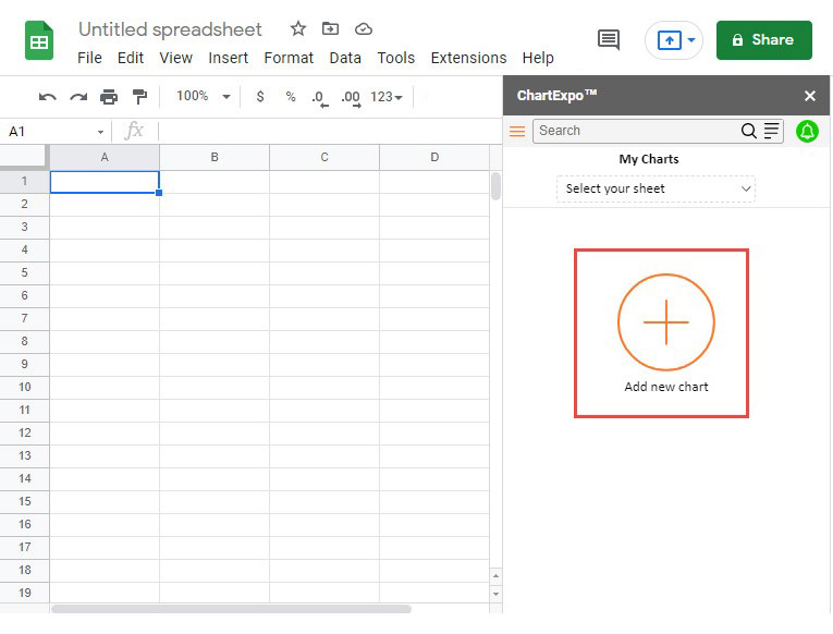
- Then click on the Add New Chart It will display a list of charts and graphs.
- Click on the Sankey Chart option to access the chart.
- Select the data you have in your Google Sheets.
- After selecting your sheet data, click on the Create Chart button.
- Your final chart will appear as shown in the screenshot below.
You now have your income vs. expenses graph.
Insights
Some insights from the Sankey Diagram include the following:
- North America is a significant contributor to profit after tax by 35%.
- The Middle East has a slightly lower contribution to profit after tax, with 32%.
- In the total revenue, there was a higher profit than losses. Profits are 66%, and losses are 34% in the three territories combined.
- The territories also had significantly low margins in tax, cost of marketing, cost of sales, and cost of general and administrative of about 11-12%.
Why Do You Need Visualization To Analyze Your Business’ Profit And Loss Data?
If you want your audience to capture the critical insights in your data story, you must provide context.
Why so?
Tables with financial information, such as Profit and Loss statements, have detailed information. It can take time for you to analyze your business’s financial status. A Mosaic plot can help visualize this data, making it easier to understand and interpret key financial metrics quickly.
How long can you obtain vital insights from your profit and loss statement data? Probably a week.
That is why a P&L visualization will save your day.
The best graph to show profit and loss can help you extract data insights more quickly. This is beneficial for your profit and loss analysis.
There is much information you can generate from your business financial data. By effectively utilizing this information, including insights from tools like Tornado charts, you can help your business grow. This approach allows you to cut unnecessary expenses and invest more in lucrative ventures.
When you have charts such as income vs. expense graphs or a small business expense report, you can make strategic decisions. Data visualization can help you convince major investors to have an input in your business.
Visualization can also help you analyze the future trends of your business. You can examine your industry’s past profit and loss trends.
All that is left of you is to make a future trajectory for your business. Help your company make more profits than losses using data visualization.
How are Profit and Loss Charts Beneficial to Your Business?
Contributes Optimization
When you use P&L charts to visualize your data, you can quickly see areas in your business that are not performing.
These charts make your data story digestible for the audience. Your target audience can also help you in decision-making for the optimum growth of your business.
With a profit and loss chart, you can identify where your business is making unnecessary expenses. With this information, you can take optimal measures to ensure your business is spending less on costs.
Mentorship and Support
Profit and loss charts help you reveal individuals’ performance in your business. You can also assess the performance of your departmental teams.
You can find ways to support underperforming individuals and teams when you obtain insights. You can do this by implementing mentoring programs that can help these teams be motivated to optimize their business input.
Strategic Planning and Projections
Profit and loss graphs can help you identify trends that can support more accurate forecasts and uncover new business opportunities.
When you identify trends in your profit and loss graphs, especially within the context of a 3-statement financial model, you can strategize how to be more competitive. One way to achieve this is by expanding your business’s revenue base.
Therefore, you will require the best graph to show profit and loss for your business. With such a strategy, you won’t need to subject your target audience to cognitive load.
Collaboration and communication
One advantage of profit and loss graphs is that they are easy to interpret. This advantage can help you easily communicate your data story to your target audience.
When presenting your charts to stakeholders, you can enable them to collaborate on the same goal. This can include a financial plan each department should accomplish before a specified timeframe.
FAQS:
Why Visualizing profit and loss data is important?
Visualizing profit and loss data is essential because it saves you time. You can obtain vital insights from your data through visualization.
When you have access to income vs. expense graphs, you can know the financial position of your business. You can also cut off unfavorable expenses in your business.
What are the best tools to show profit and loss data?
Some tools are essential for this task when you want to show profit and loss in your data. It is vital to have a spreadsheet tool such as Google Sheets.
But since Google Sheets is limited, supercharge it with ChartExpo. This add-on will help you visualize your p&l statement easily.
Wrap Up
Let’s recap everything we have discussed.
We have seen that analyzing your financial data in tables can be time-consuming. The goal is to gain insights into your business growth.
Despite this challenge, we found a solution. Visualizing profit and loss data gives you the insights you need for your business.
With the help of ChartExpo, we can obtain the best graph to show profit and loss in your business. Some of the graphs we have covered include the following:
- Waterfall Chart
- Sankey Diagram
- Treemaps
- Matrix Chart
- Sentiment Trend Chart
We focused majorly on a Sankey Diagram and provided an example. We could gain meaningful insights quickly from the Sankey Chart.
Now it’s your turn to try ChartExpo today.
Start a 7-day free trial to access numerous charts to analyze your profits and loss for your business.


Comments
Post a Comment